React Native 캐러셀(carousel) 만들기
-%EB%A7%8C%EB%93%A4%EA%B8%B0/&count_bg=%2379C83D&title_bg=%23555555&icon=&icon_color=%23E7E7E7&title=hits&edge_flat=false)
많은 앱/웹 서비스에서 캐러셀(carousel)을 사용해 사용자들에게 콘텐츠를 제공하고 있다. 리액트 네이티브에서 캐러셀을 구현하기 위해 react-native-snap-carousel 등의 라이브러리를 사용할 수 있지만 라이브러리 없이도 충분히 구현이 가능하다. 이번 포스팅 에서는 외부 라이브러리 없이 React Native 기본 API 만으로 캐러셀을 만드는 방법을 알아 보자.
환경
- react-native v.0.63.3
- typescript v.4.0.3
- styled-components v.5.2.0
디자인 값 정의
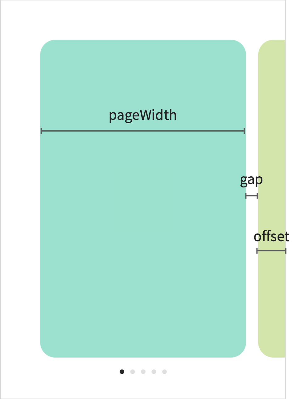
먼저, 아래 그림과 같이 pageWidth, gap, 그리고 offset을 정의한다.
구현
App.tsx
...
const screenWidth = Math.round(Dimensions.get('window').width);
const PAGES = [
  {
    num: 1,
    color: '#86E3CE',
  },
  {
    num: 2,
    color: '#D0E6A5',
  },
  {
    num: 3,
    color: '#FFDD94',
  },
  {
    num: 4,
    color: '#FA897B',
  },
  {
    num: 5,
    color: '#CCABD8',
  },
];
...

function App(){
    ...
    return (
        ...
        <Carousel
          gap={16}
          offset={36}
          pages={PAGES}
          pageWidth={screenWidth - (16 + 36) * 2}
        />
        ...
    )
}
Carousel.tsx
캐러셀은 FlatList 혹은 ScrollView로 구현할 수 있는데, snapToInterval과 pagingEnabled를 함께 사용하면, paging이 snapToInterval 값 간격으로 진행된다. 일반적으로 snapToAlignment와 decelerationRate = "fast"와 함께 사용한다.
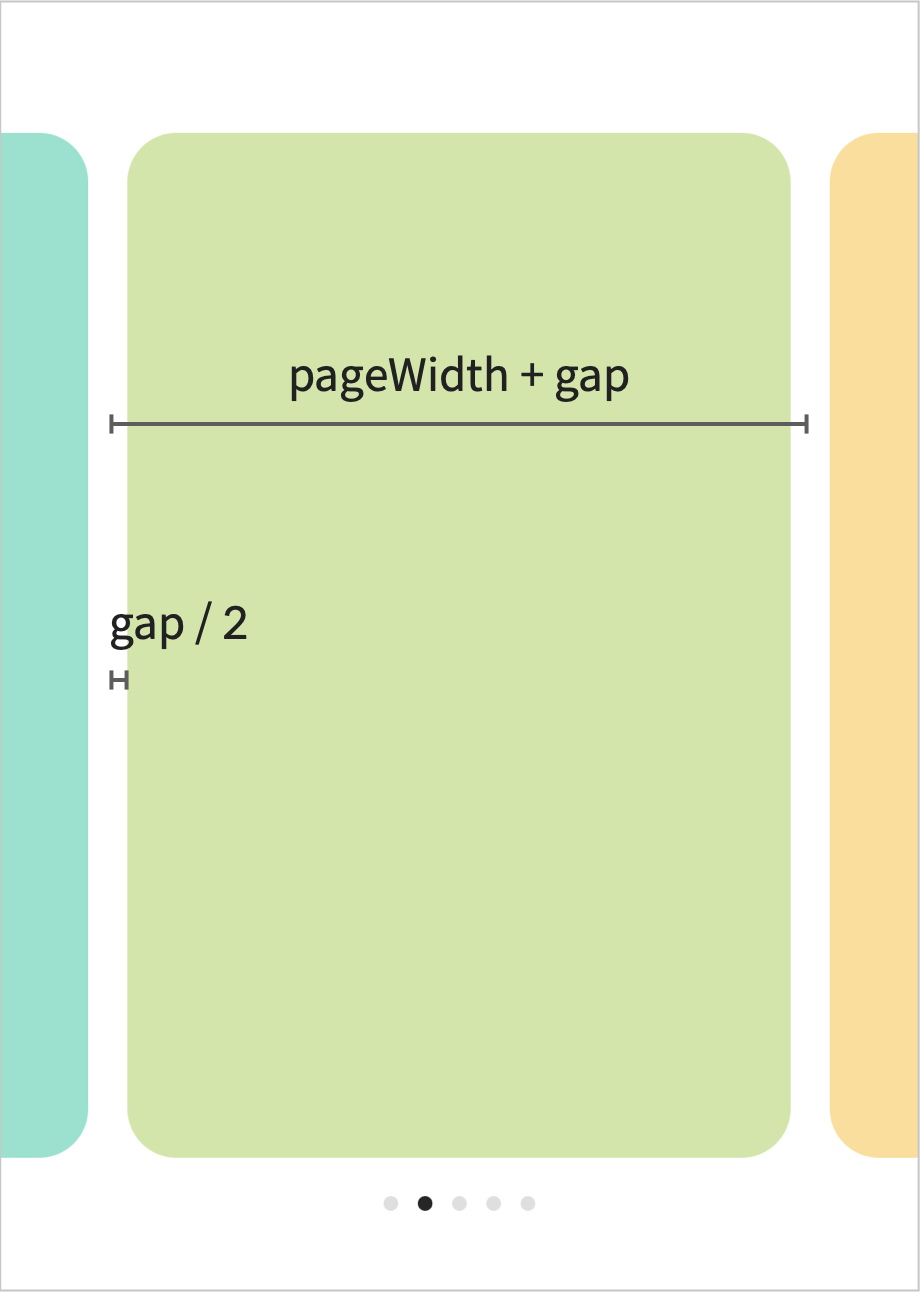
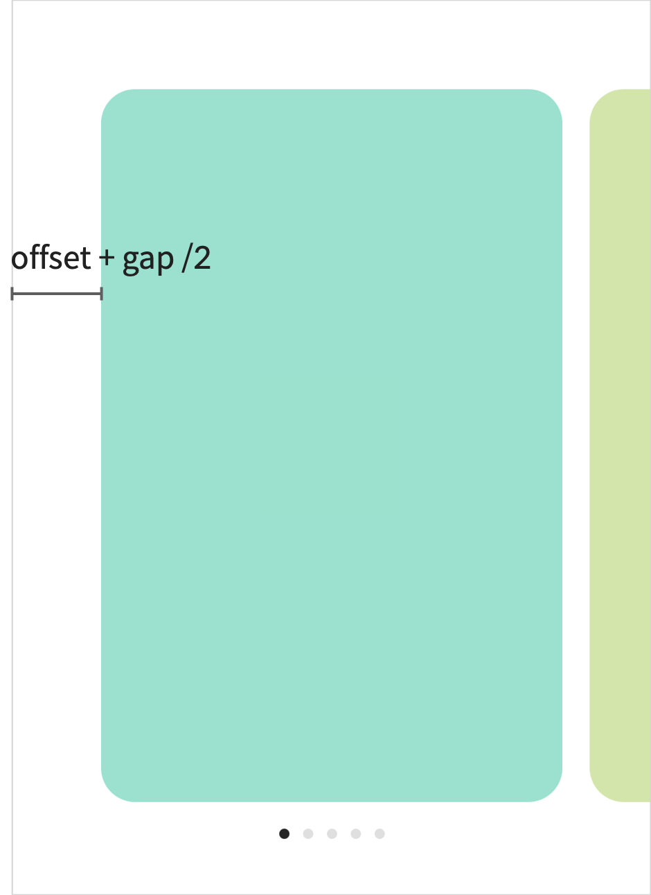
한 캐러셀 페이지는 pageWidth + gap이며, FlatList / ScrollView의 contentContainerStyle로 paddingHorizontal: offset + gap / 2를, page의 양쪽 margin을 gap / 2로 정의해 준다.
<FlatList
    automaticallyAdjustContentInsets={false}
    contentContainerStyle={{
        paddingHorizontal: offset + gap / 2,
    }}
    data={pages}
    decelerationRate="fast"
    horizontal
    keyExtractor={(item: any) => `page__${item.color}`}
    onScroll={onScroll}
    pagingEnabled
    renderItem={renderItem}
    snapToInterval={pageWidth + gap}
    snapToAlignment="start"
    showsHorizontalScrollIndicator={false}
/>
page indicator는 onScroll을 사용해, focus된 page index를 확인할 수 있다.
const onScroll = (e: any) => {
    const newPage = Math.round(
      e.nativeEvent.contentOffset.x / (pageWidth + gap),
    );
    setPage(newPage);
};
전체 코드는 아래와 같이 작성할 수 있다.
import React, {useState} from 'react';
import {FlatList} from 'react-native';
import styled from 'styled-components/native';
import Page from './Page';

interface ICarousel {
  gap: number;
  offset: number;
  pages: any[];
  pageWidth: number;
}

const Container = styled.View`
  height: 60%;
  justify-content: center;
  align-items: center;
`;

const Indicator = styled.View<{focused: boolean}>`
  margin: 0px 4px;
  background-color: ${(props) => (props.focused ? '#262626' : '#dfdfdf')};
  width: 6px;
  height: 6px;
  border-radius: 3px;
`;

const IndicatorWrapper = styled.View`
  flex-direction: row;
  align-items: center;
  margin-top: 16px;
`;

export default function Carousel({pages, pageWidth, gap, offset}: ICarousel) {
  const [page, setPage] = useState(0);

  function renderItem({item}: any) {
    return (
      <Page item={item} style={{width: pageWidth, marginHorizontal: gap / 2}} />
    );
  }

  const onScroll = (e: any) => {
    const newPage = Math.round(
      e.nativeEvent.contentOffset.x / (pageWidth + gap),
    );
    setPage(newPage);
  };

  return (
    <Container>
      <FlatList
        automaticallyAdjustContentInsets={false}
        contentContainerStyle={{
          paddingHorizontal: offset + gap / 2,
        }}
        data={pages}
        decelerationRate="fast"
        horizontal
        keyExtractor={(item: any) => `page__${item.color}`}
        onScroll={onScroll}
        pagingEnabled
        renderItem={renderItem}
        snapToInterval={pageWidth + gap}
        snapToAlignment="start"
        showsHorizontalScrollIndicator={false}
      />
      <IndicatorWrapper>
        {Array.from({length: pages.length}, (_, i) => i).map((i) => (
          <Indicator key={`indicator_${i}`} focused={i === page} />
        ))}
      </IndicatorWrapper>
    </Container>
  );
}
Page.tsx
Page.tsx는 각 Carousel item이므로 사용 용도에 맞게 작성해 준다.
import React from 'react';
import styled from 'styled-components/native';
import {ViewStyle} from 'react-native';

interface IPage {
  item: {num: number; color: string};
  style: ViewStyle;
}

const PageItem = styled.View<{color: string}>`
  background-color: ${(props) => props.color};
  justify-content: center;
  align-items: center;
  border-radius: 20px;
`;

const PageNum = styled.Text``;

export default function Page({item, style}: IPage) {
  return (
    <PageItem color={item.color} style={style}>
      <PageNum>{item.num}</PageNum>
    </PageItem>
  );
}
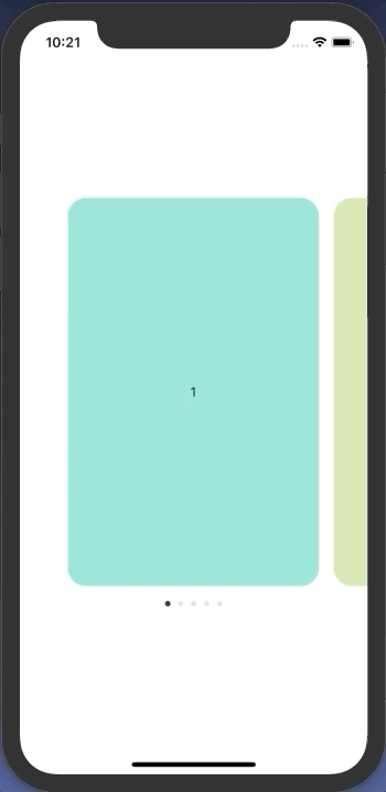
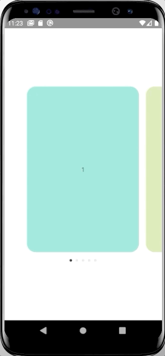
실제 구현 모습은 아래와 같다.
👩🏻💻 배우는 것을 즐기는 프론트엔드 개발자 입니다
부족한 블로그에 방문해 주셔서 감사합니다 🙇🏻♀️
in the process of becoming the best version of myself