React Native 커스텀 탭 바 네비케이션 만들기
React Navigation을 이용하여 Top Tab Bar를 커스텀 하는 방법을 알아보자.
기본 TopTabNavigator 적용하기
react-navigation 기본 설정
먼저, react-navigation v5를 사용하는데 필요한 기본 라이브러리를 설치한다.
npm install @react-navigation/native
npm install react-native-reanimated react-native-gesture-handler react-native-screens react-native-safe-area-context @react-native-community/masked-view

npx pod-install ios
index.js 파일에 아래 코드를 추가한다.
import 'react-native-gesture-handler';
TopTabNavigator 적용하기
TopTabNavigator는 @react-navigation/material-top-tabs의 createMaterialTopTabNavigator API를 사용하여 구현할 수 있다.공식문서
npm install @react-navigation/material-top-tabs react-native-tab-view
필요 라이브러리를 설치하고, src/navigation/navigator.tsx를 생성한 뒤 아래와 같이 Navigation 컴포넌트를 만든다.
import React from 'react';
import {NavigationContainer} from '@react-navigation/native';
import {createMaterialTopTabNavigator} from '@react-navigation/material-top-tabs';
import First from '../screens/First';
import Second from '../screens/Second';
import Third from '../screens/Third';

const Tab = createMaterialTopTabNavigator();

function Tabs() {
  return (
    <Tab.Navigator>
      <Tab.Screen name="First" component={First} />
      <Tab.Screen name="Second" component={Second} />
      <Tab.Screen name="Third" component={Third} />
    </Tab.Navigator>
  );
}

export default function () {
  return (
    <NavigationContainer>
        <Tabs />
    </NavigationContainer>
  );
}
src/App.tsx에 위에서 정의한 네비게이션을 적용한다.
import React from 'react';
import {SafeAreaView} from 'react-native';
import AppNavigator from './navigation/Navigator';

export default function App() {
  return (
    <>
      <SafeAreaView />
      <AppNavigator />
    </>
  );
}
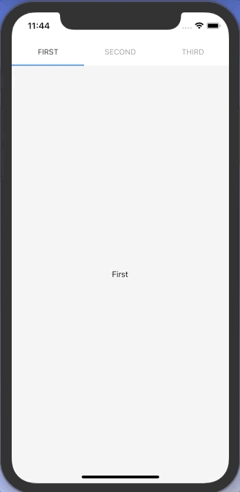
여기까지 하면 아래와 같은 기본 TopTabNavigator가 적용된다.
커스텀 Top Tab Bar 적용하기
이번에는 탭바 상단에 검색창이 있는 커스텀 TopTabNavigator를 만들어 보자.
먼저, src/navigation/navigator.tsx의 Tabs 컴포넌트를 아래와 같이 수정해 준다.
TabBar 컴포넌트는 곧 작성해 줄 커스텀 탭 바 컴포넌트 이다. 기본적으로 Tab.Screen에 정의 해 준 name이 표기 될 텐데, tabBarLabel을 추가적으로 설정해 주고 싶다면 options={{tabBarLabel: 라벨명}} 을 프롭스로 넘겨준다.
...
function Tabs() {
  return (
    <Tab.Navigator tabBar={(props) => <TabBar {...props} />}>
      <Tab.Screen
        name="First"
        component={First}
        // options={{tabBarLabel: '라벨명'}}
        />
      <Tab.Screen name="Second" component={Second} />
      <Tab.Screen name="Third" component={Third} />
    </Tab.Navigator>
  );
}
...
이제 TabBar 컴포넌트를 만들어 줄 차례이다. 먼저, src/components/SearchBar.tsx를 만들어 준다.
import React, {useState} from 'react';
import styled from 'styled-components/native';

const SearchBarWrapper = styled.View`
  flex-direction: row;
  align-items: center;
  background-color: #efefef;
  border-radius: 4px;
  padding: 10px 14px 10px 12px;
  margin: 0px 20px;
  display: flex;
`;

const SearchInput = styled.TextInput`
  margin-left: 10px;
  include-font-padding: false;
  padding: 0px;
`;

const SearchIcon = styled.Image`
  width: 18px;
  height: 18px;
`;

export default function SearchBar() {
  const [value, setValue] = useState('');

  return (
    <SearchBarWrapper>
      <SearchIcon source={require('../assets/search.png')} />
      <SearchInput
        autoCapitalize="none"
        autoCorrect={false}
        onChangeText={setValue}
        placeholder="검색어를 입력해 주세요."
        returnKeyType="search"
        returnKeyLabel="search"
        value={value}
      />
    </SearchBarWrapper>
  );
}
src/components/SearchBar.tsx를 만들어 준다. state, descriptors, navigation이 Tab.Navigator로 부터 props로 전달 되는데, state.routes에 tab bar를 구성하는 route 정보가 있고, state.index를 이용해 현재 포커스 된 스크린을 확인할 수 있다. navigator 정의 시 options를 정의해 주었다면, descriptors를 활용해 options에 정의한 내용을 활용할 수 있다.
import React from 'react';
import styled from 'styled-components/native';
import {MaterialTopTabBarProps} from '@react-navigation/material-top-tabs';
import SearchBar from './SearchBar';

type Route = {
  key: string;
  name: string;
  params?: object | undefined;
};

const Container = styled.View`
  margin-top: 16px;
`;

const TabWrapper = styled.View`
  flex-direction: row;
  display: flex;
  align-items: center;
  margin-top: 16px;
  padding-left: 4px;
`;

const TabButton = styled.TouchableOpacity<{isFocused: boolean}>`
  align-items: center;
  justify-content: center;
  height: 40px;
  margin: 0px 16px;
  border-bottom-width: 2px;
  border-bottom-color: ${(props) =>
    props.isFocused ? '#5d004a' : 'transparent'};
`;

const TabText = styled.Text<{isFocused: boolean}>`
  font-weight: 800;
  color: ${(props) => (props.isFocused ? '#5d004a' : '#000000')};
`;

export default function TabBar({
  state,
  descriptors,
  navigation,
}: MaterialTopTabBarProps) {
  return (
    <Container>
      <SearchBar />
      <TabWrapper>
      {state.routes.map((route: Route, index: number) => {
        // const {options} = descriptors[route.key];
        // const label = options.tabBarLabel;
        const label = route.name;
        const isFocused = state.index === index;

        const onPress = () => {
          const event = navigation.emit({
            type: 'tabPress',
            target: route.key,
            canPreventDefault: true,
          });
          if (!isFocused && !event.defaultPrevented) {
            navigation.navigate(route.name);
          }
        };
        return (
          <TabButton isFocused={isFocused} onPress={onPress} key={`tab_${index}`}>
            <TabText isFocused={isFocused}>{label}</TabText>
          </TabButton>
        )
      })}
      </TabWrapper>
    </Container>
  )
}
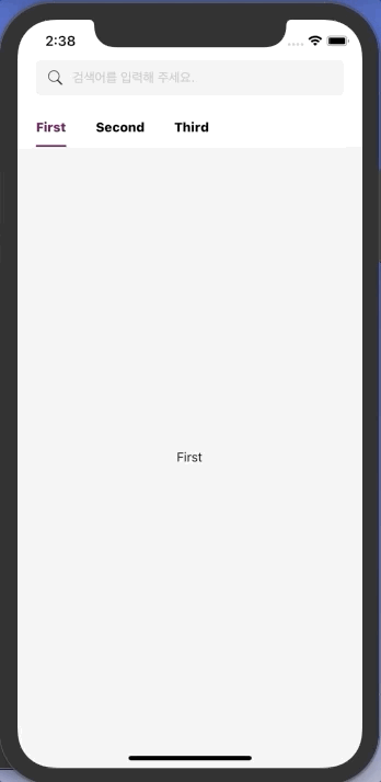
커스텀 탭 바가 적용된 것을 확인할 수 있다.
Sliding Tab Bar 추가하기
이번에는 애니메이션을 추가해 Sliding Tab Bar를 적용해 보자.
Tab 마다 위치와 넓이가 다르므로 각 Tab이 렌더될 때 onLayout 메서드를 사용해 x 좌표와 width를 state 값으로 가지고 있다가, focus 된 탭의 x, width 값으로 Sliding Bar를 이동시키는 방법으로 구현하려고 한다.
먼저, Animated를 이용해 TabBar.tsx에 Sliding Tab Bar를 추가해 준다. 그리고 state.routes.map 내부의 Tab 부분을 따로 컴포넌트로 분리한다.
...
import {Animated} from 'react-native';
import Tab from './Tab';
...

const BottomLine = styled.View`
  background-color: #5d004a;
  height: 2px;
  width: 100%;
`;
...

export default function TabBar({
  state,
  descriptors,
  navigation,
}: MaterialTopTabBarProps) {
  const [translateValue] = useState(new Animated.Value(0));
  const [width, setWidth] = useState(0);
  const [toValue, setToValue] = useState(0);

  useEffect(() => {
    Animated.spring(translateValue, {
      toValue,
      damping: 10,
      mass: 1,
      stiffness: 100,
      overshootClamping: true,
      restDisplacementThreshold: 0.001,
      restSpeedThreshold: 0.001,
      useNativeDriver: true,
    }).start();
  }, [state, translateValue, toValue]);

  return (
    <Container>
      <SearchBar />
      <TabWrapper>
        {state.routes.map((route: Route, index: number) => {
          // const {options} = descriptors[route.key];
          // const label = options.tabBarLabel;
          const label = route.name;
          const isFocused = state.index === index;
          const onPress = () => {
            const event = navigation.emit({
              type: 'tabPress',
              target: route.key,
              canPreventDefault: true,
            });
            if (!isFocused && !event.defaultPrevented) {
              navigation.navigate(route.name);
            }
          };
          return (
            <Tab
              isFocused={isFocused}
              key={`tab_${index}`}
              label={label}
              onPress={onPress}
              setToValue={setToValue}
              setWidth={setWidth}
            />
          );
        })}
      </TabWrapper>
      <BottomLine
        as={Animated.View}
        style={{
          transform: [{translateX: translateValue}],
          width,
        }}
      />
    </Container>
  );
}
분리한 src/components/Tab.tsx 컴포넌트는 아래와 같이 작성하여 focus 될 때마다 sliding bar의 animation value를 변경할 수 있도록 한다.
import React, {useEffect, useState} from 'react';
import styled from 'styled-components/native';

interface ITab {
  isFocused: boolean;
  label: string;
  onPress: () => void;
  setToValue: (params: number) => void;
  setWidth: (params: number) => void;
}

const TabButton = styled.TouchableOpacity<{isFocused: boolean}>`
  align-items: center;
  justify-content: center;
  height: 40px;
  margin: 0px 16px;
`;

const TabText = styled.Text<{isFocused: boolean}>`
  font-weight: 800;
  color: ${(props) => (props.isFocused ? '#5d004a' : '#000000')};
`;

export default function Tab({
  isFocused,
  label,
  onPress,
  setToValue,
  setWidth,
}: ITab) {
  const [layout, setLayout] = useState<any>(null);
  useEffect(() => {
    if (isFocused && layout) {
      setToValue(layout.x);
      setWidth(layout.width);
    }
  }, [isFocused, layout, setToValue, setWidth]);

  const onLayout = (e: any) => {
    const {x, width} = e.nativeEvent.layout;
    setLayout({x, width});
  };

  return (
    <TabButton isFocused={isFocused} onPress={onPress} onLayout={onLayout}>
      <TabText isFocused={isFocused}>{label}</TabText>
    </TabButton>
  );
}
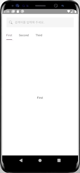
Sliding Tab Bar 까지 적용된 모습이다.

👩🏻💻 배우는 것을 즐기는 프론트엔드 개발자 입니다
부족한 블로그에 방문해 주셔서 감사합니다 🙇🏻♀️
in the process of becoming the best version of myself